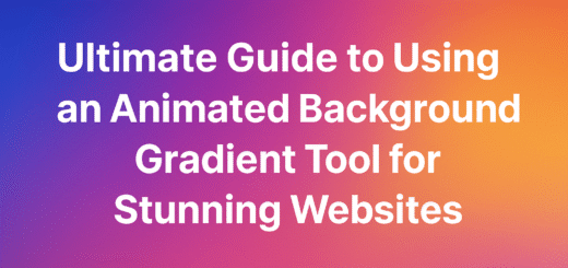
Dynamic Design: Mastering Animated Gradient Borders with Generators
Introduction: The Dawn of Dynamic Web Aesthetics
Imagine visiting a website where a subtle, flowing gradient border gracefully pulses around a call-to-action button, its colors shifting like a serene sunset. Your eye is instinctively drawn to it, creating an intuitive pathway through the interface. This isn’t just decorative flair—it’s strategic design that enhances user experience through carefully crafted motion and color. Welcome to the era of animated gradient borders, where static web elements transform into dynamic storytelling tools that captivate and guide users in equal measure.
In today’s competitive digital landscape, websites must do more than simply present information—they need to create memorable experiences. Animated gradient borders represent a sophisticated fusion of color theory, motion design, and user psychology that elevates ordinary interfaces into extraordinary digital environments. These effects bridge the gap between functional minimalism and engaging visual richness, offering a middle ground that respects usability while embracing creative expression.
This comprehensive guide will explore why these effects have become essential tools in the modern web designer’s arsenal, how to implement them effectively, and when to deploy them for maximum impact. We’ll demystify the underlying CSS principles, showcase practical applications, and introduce you to powerful tools that streamline the creation process. Whether you’re a seasoned front-end developer or a content creator looking to enhance your site’s visual appeal, understanding animated gradient borders will transform how you approach web design.
The Psychology of Visual Appeal: Why Animated Borders Work
The human brain is hardwired to notice movement and color contrasts—survival mechanisms that helped our ancestors detect threats and opportunities in their environment. In web design, we harness these innate tendencies to guide user attention and create intuitive interfaces. Animated gradient borders leverage several psychological principles that make them particularly effective.
Guiding Attention Through Subtle Motion
Unlike flashy animations that can distract or annoy users, subtle border animations create what psychologists call “attentional capture”—the involuntary redirecting of visual focus. When implemented correctly, these animations serve as visual cues that direct users toward important elements without overwhelming the overall experience. A gently pulsing border around a subscription form or a flowing gradient along a navigation menu creates a hierarchy of importance that users subconsciously follow.
Emotional Resonance Through Color Transitions
Gradients themselves carry emotional weight, with different color combinations evoking distinct feelings and associations. By animating these gradients, we add a temporal dimension to this emotional communication. A transition from cool blues to warm oranges can suggest a shift from professionalism to approachability, while a looping spectrum might convey innovation and creativity. The continuous evolution of color creates a living, breathing interface that feels more responsive and engaging than static designs.
Gestalt Principles in Motion
The Gestalt psychology principles of proximity, similarity, and continuity find new expression in animated borders. Animated gradients can strengthen the perception of relatedness between elements, create visual continuity across different sections of a website, and establish clear boundaries while maintaining visual flow. When a border animation repeats across multiple cards or buttons, it reinforces their conceptual relationship while adding rhythmic consistency to the layout.
Understanding the CSS Behind the Magic
Before we explore the tools that simplify the process, it’s essential to understand the core CSS concepts that power animated gradient borders. This foundation will help you make informed decisions when customizing generated code and troubleshooting implementation issues.
CSS Gradients: The Color Foundation
CSS offers three primary gradient types that serve as the building blocks for animated borders:
css
/* Linear Gradient */
.linear-example {
  background: linear-gradient(45deg, #ff6b6b, #4ecdc4, #45b7d1);
}

/* Radial Gradient */
.radial-example {
  background: radial-gradient(circle, #ff6b6b, #4ecdc4);
}

/* Conic Gradient */
.conic-example {
  background: conic-gradient(from 0deg, #ff6b6b, #4ecdc4, #45b7d1, #ff6b6b);
}
Each gradient type creates distinct visual effects. Linear gradients transition colors along a straight line, radial gradients emanate from a central point, and conic gradients sweep around a center point like a color wheel.
Creating Basic Gradient Borders
The challenge with gradient borders in CSS is that the border property doesn’t directly accept gradient values. Instead, we typically use one of these techniques:
css
/* Method 1: Using background-clip with padding */
.gradient-border-1 {
  padding: 5px; /* This creates the border width */
  background: linear-gradient(45deg, #ff6b6b, #4ecdc4);
  background-clip: padding-box;
  position: relative;
}

.gradient-border-1::before {
  content: '';
  position: absolute;
  top: -5px;
  left: -5px;
  right: -5px;
  bottom: -5px;
  background: linear-gradient(45deg, #ff6b6b, #4ecdc4);
  z-index: -1;
  border-radius: inherit;
}

/* Method 2: Using border-image */
.gradient-border-2 {
  border: 5px solid;
  border-image: linear-gradient(45deg, #ff6b6b, #4ecdc4) 1;
}
Each method has trade-offs. The background-clip approach offers more control but requires additional markup, while border-image is simpler but has limited browser support for complex animations.
Bringing Borders to Life with CSS Animations
The magic happens when we introduce animation to these gradients using CSS keyframes:
css
@keyframes gradientShift {
  0% {
    background-position: 0% 50%;
  }
  50% {
    background-position: 100% 50%;
  }
  100% {
    background-position: 0% 50%;
  }
}

.animated-border {
  background: linear-gradient(45deg, #ff6b6b, #4ecdc4, #45b7d1, #96ceb4);
  background-size: 400% 400%;
  animation: gradientShift 5s ease infinite;
}
This code creates a seamless looping animation by shifting the background position of an oversized gradient. The background-size property is set larger than the element (400% in this case), and the animation moves the background position to create the illusion of flowing colors.
The Case for Using an Animated Gradient Border Generator
While understanding the underlying code is valuable, manually crafting these effects can be time-consuming, especially when fine-tuning animation timing, color transitions, and browser compatibility. This is where an animated gradient border generator becomes invaluable. These tools provide visual interfaces for experimenting with effects that would require extensive trial-and-error coding, dramatically accelerating the design process while ensuring cross-browser compatibility.
Animated Gradient Border Generator Tools: A Comprehensive Comparison
The market offers numerous tools for creating animated gradient borders, each with unique strengths and specializations. Here’s a detailed comparison of the most popular options:
| Tool Name | Price | Ease of Use | Customization | Code Export | Key Features |
|---|---|---|---|---|---|
| FreeToolsMax Animated Gradient Border Generator | Free | ★★★★★ | High | Yes | Real-time preview, extensive animation library, CSS/SCSS export |
| Animista | Free | ★★★★☆ | Medium | Yes | Pre-built animations, customization tools, animation play controls |
| CSS Gradient | Free | ★★★★☆ | Medium | Yes | Gradient-focused interface, color palette tools, sharing options |
| ColorSpace | Free | ★★★☆☆ | Low | Limited | Color palette generation with CSS code snippets |
| UI Gradients | Free | ★★★☆☆ | Low | Yes | Curated gradient collection, simple code export |
In-Depth Tool Reviews
FreeToolsMax Animated Gradient Border Generator
This comprehensive tool stands out for its balance of power and accessibility. The interface features a real-time preview panel that updates instantly as you adjust settings, making experimentation intuitive. Users can customize gradient angles, colors, animation speed, and border width through simple sliders and color pickers. The tool exports clean, well-commented CSS code that’s ready for production, with options for SCSS variables for maintainability. What sets this animated gradient border generator apart is its extensive library of preset animations—from subtle pulses to dramatic flows—that serve as excellent starting points for customization.
Visual Description: The FreeToolsMax interface displays a central preview panel showing a card element with an animated purple-to-blue gradient border. To the left, color pickers allow selection of multiple gradient stops, while the right panel offers sliders for animation duration, border width, and gradient angle. A dropdown menu presents animation presets like “Pulse,” “Flow,” and “Radial Sweep.”
Animista
Animista specializes in CSS animations with a focus on usability. The tool categorizes animations by type (entrance, exit, attention-seeking) and provides fine-grained controls for timing and iteration. While its gradient capabilities are more limited than specialized tools, Animista excels at creating complex animation sequences that can be combined with gradient borders created elsewhere. The interface features a play/pause button for testing animations before implementation.
CSS Gradient
As the name suggests, this tool focuses primarily on gradient creation with animation as a secondary feature. Its strength lies in its sophisticated gradient editor, which supports complex color stops and blending modes. The animated border features are more basic but sufficient for simple effects. CSS Gradient is particularly valuable for designers who prioritize color precision over complex motion.
Implementation Example Using Generated Code
Here’s how code from an animated gradient border generator typically implements in a real project:
html
<!DOCTYPE html>
<html>
<head>
<style>
.gradient-card {
  width: 300px;
  padding: 20px;
  border-radius: 12px;
  position: relative;
  background: #ffffff;
  margin: 50px auto;
}

.gradient-card::before {
  content: '';
  position: absolute;
  top: -3px;
  left: -3px;
  right: -3px;
  bottom: -3px;
  background: linear-gradient(45deg, #ff6b6b, #4ecdc4, #45b7d1);
  border-radius: 15px;
  z-index: -1;
  background-size: 400% 400%;
  animation: gradientFlow 3s ease infinite;
}

@keyframes gradientFlow {
  0% { background-position: 0% 50%; }
  50% { background-position: 100% 50%; }
  100% { background-position: 0% 50%; }
}

.gradient-card h3 {
  margin-top: 0;
  color: #333;
}

.gradient-card p {
  color: #666;
  line-height: 1.5;
}
</style>
</head>
<body>
  <div class="gradient-card">
    <h3>Featured Content</h3>
    <p>This card demonstrates how an animated gradient border can draw attention to important content without overwhelming the design.</p>
  </div>
</body>
</html>
This example shows a complete implementation with proper positioning and z-index management to ensure the gradient border appears correctly behind the content.
Practical Applications & Design Inspiration
Animated gradient borders offer versatile applications across web interfaces. When deployed strategically, they enhance both aesthetics and functionality.
Buttons and Call-to-Action Elements
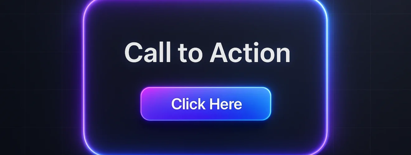
Primary buttons with subtle animated borders significantly increase conversion rates by drawing attention without being intrusive. Consider a “Subscribe Now” button with a gentle pulse animation that cycles between brand colors. The motion creates urgency while the gradient adds visual appeal that distinguishes it from secondary buttons. The key is subtlety—animations should complement the action rather than distract from it.
Visual Description: A subscription form features a vibrant “Join Now” button with a border that cycles through a gradient spectrum from electric blue to vibrant purple. The animation pulses gently, creating a sense of importance without flashing aggressively. Surrounding form fields have static borders, making the animated button the clear focal point.
Navigation Menus and Interactive Elements
Animated borders can enhance navigation usability by providing clear visual feedback. When a user hovers over a menu item, a gradient border can animate into view, confirming the interactive state. This technique works particularly well for tabbed interfaces, where an animated underline can transition smoothly between sections, creating a polished, app-like experience.
Image Frames and Portfolio Galleries
Photography portfolios and image galleries benefit from animated borders that complement without competing with the visual content. A subtle gradient frame that shifts colors at different viewing angles can add depth to images without distracting from the subject matter. The animation speed should be slow enough to avoid drawing attention away from the primary content.
Section Dividers and Content Separators
Horizontal rules with animated gradient borders can create elegant transitions between website sections. Unlike static dividers, these animated elements guide the eye down the page, creating rhythm and flow. A divider that pulses gently when it enters the viewport can signal content transitions more effectively than static alternatives.
Cards and Content Containers
Product cards, feature highlights, and testimonial containers gain visual hierarchy through animated borders. The key is consistency—using similar animation patterns across related elements creates cohesion while allowing important cards to feature more prominent animations. For example, a premium product card might feature a more elaborate border animation than standard options.
Best Practices for Implementation
While animated gradient borders offer exciting possibilities, their effectiveness depends on thoughtful implementation. Follow these guidelines to ensure your animations enhance rather than detract from the user experience.
Performance Optimization
Complex animations can impact website performance, particularly on mobile devices. Optimize your animated gradient borders by:
- Using
transformandopacityproperties instead of properties that trigger layout recalculations - Employing the
will-changeproperty sparingly to hint to browsers which elements will animate - Limiting the number of simultaneously animated elements on a page
- Providing reduced-motion alternatives for users who prefer them
css
/* Performance-optimized animation */
.optimized-border {
  /* Use transforms and opacity for better performance */
  transform: translateZ(0);
  will-change: transform;
}

/* Respect user motion preferences */
@media (prefers-reduced-motion: reduce) {
  .animated-border {
    animation: none;
  }
}
Accessibility Considerations
Animation can create barriers for users with vestibular disorders or attention-related disabilities. Ensure your implementations are accessible by:
- Providing a mechanism to disable animations (or respecting the
prefers-reduced-motionmedia query) - Ensuring animations don’t flash more than three times per second (to avoid triggering seizures)
- Maintaining sufficient color contrast between animated elements and their backgrounds
- Ensuring essential information isn’t conveyed solely through animation
Brand Consistency and Subtlety
Animated gradient borders should align with your brand’s visual identity rather than working against it. Choose gradient colors from your brand palette and animation styles that reflect your brand personality—a financial institution might opt for slow, conservative animations, while a entertainment brand could embrace more dynamic effects. Remember that subtlety typically outperforms extravagance; the most effective animations are often those users notice subconsciously rather than overtly.
Strategic Placement and Purpose
Every animated element should serve a clear purpose. Before adding an animated border, ask:
- Does this animation guide the user toward important content?
- Does it provide valuable feedback for interactions?
- Does it enhance the storytelling without distracting from the message?
- Would the design suffer if the animation were removed?
Animations that can’t pass this test likely detract from rather than enhance the user experience.
Conclusion: Embracing the Future of Web Design
Animated gradient borders represent more than a passing trend—they embody the evolution of web design toward more dynamic, engaging, and intuitive interfaces. When implemented with purpose and precision, these effects bridge the gap between aesthetic appeal and functional design, creating digital experiences that resonate on both visual and emotional levels.
The tools and techniques we’ve explored demonstrate that creating these effects has never been more accessible. Whether you’re hand-coding custom animations or leveraging the power of an animated gradient border generator, the potential to enhance your projects is limited only by your creativity. Remember that the most successful implementations balance innovation with restraint, using motion and color to guide rather than overwhelm.
As you experiment with these techniques, keep the user experience at the forefront of your decisions. The best animations feel inevitable rather than decorative—natural extensions of the interface that users appreciate without consciously noticing. This subtlety is the hallmark of sophisticated web design.
Ready to create your own stunning animated gradient borders? Experiment with the techniques discussed in this article and try our comprehensive Animated Gradient Border Generator at [https://freetoolsmax.com/tools/Animated-Gradient-Border-Generator/] to quickly bring your visual ideas to life. The future of web design is dynamic, and with these tools at your disposal, you’re perfectly positioned to lead the way.