
Ultimate Guide to Using an Accent Color Tester Tool for Better Web Design
In the world of web design, color selection can make or break your user experience. Choosing the right accent color is particularly crucial as it guides user attention, establishes visual hierarchy, and reinforces brand identity. This comprehensive guide will explore how our Accent Color Tester tool can revolutionize your design workflow and help you create visually stunning interfaces.
What is an Accent Color Tester Tool?
An accent color tester is an interactive web application that allows designers and developers to preview how different accent colors will look in various UI components. This invaluable tool provides real-time visualization of color choices across buttons, alerts, cards, progress bars, and other interface elements. By testing colors in context before implementation, you can avoid costly redesigns and ensure visual consistency throughout your application.
The Accent Color Tester tool at FreeToolsMax offers a comprehensive solution for color testing with instant preview capabilities. Unlike static color pickers, our tool demonstrates how your chosen accent color interacts with different states (hover, active) and complementary shades. This holistic approach to color testing helps you make informed decisions about your palette selection.
Using an accent color tester saves countless hours that would otherwise be spent coding and testing color schemes manually. The immediate visual feedback allows for rapid iteration and refinement of your color choices. Whether you’re working on a brand new project or refreshing an existing design, this tool streamlines the color selection process significantly.
Why Accent Colors Matter in Web Design
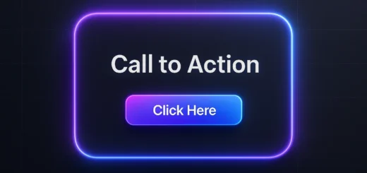
Accent colors serve as visual guides that direct user attention to important elements and actions. When used strategically, they create visual hierarchy and improve navigation through your interface. A well-chosen accent color can increase conversion rates by making call-to-action buttons more prominent and clickable. Conversely, poor color choices can create visual confusion and diminish user experience.
Psychological aspects of color play a significant role in how users perceive your website or application. Different colors evoke different emotions and associations—blue conveys trust and professionalism, while orange suggests energy and creativity. The Accent Color Tester tool helps you evaluate these psychological impacts in the context of your specific design before finalizing your color scheme.
From a branding perspective, accent colors reinforce brand identity and improve recognition. Consistent use of brand colors across all touchpoints creates a cohesive experience that users will remember. Our color testing tool ensures that your accent colors work harmoniously with your primary brand colors and maintain accessibility standards across all UI components.
Key Features of Our Accent Color Tester Tool
Our Accent Color Tester offers an extensive set of features designed to meet the needs of both designers and developers. The color selection interface includes multiple input methods: a visual color picker, hexadecimal code input, and preset color options. This flexibility allows you to work in whichever way you’re most comfortable, whether you’re selecting colors visually or working with specific brand color codes.
The live preview section is arguably the most valuable feature, displaying your chosen accent color across various UI components in real-time. You can see how your color works with buttons, alerts, cards, progress bars, badges, and text elements simultaneously. This comprehensive preview eliminates surprises during implementation and ensures your color works well in all contexts.
Customization options allow you to toggle different UI elements on and off, focusing on specific components that matter most to your project. The CSS output feature generates ready-to-use code snippets with CSS custom properties (variables) for easy implementation. You can copy the code directly or download it as a CSS file, significantly speeding up your development process.
How to Use the Accent Color Tester Tool Effectively
Using our Accent Color Tester is straightforward, but following a systematic approach will yield the best results. Start by entering your base accent color using either the color picker or hexadecimal input field. If you’re unsure where to begin, try the random color button to generate inspiration or use one of the carefully curated preset colors designed to work well in digital interfaces.
Once you’ve selected your base color, examine how it appears across the various UI components in the preview panel. Pay special attention to contrast ratios, especially for text elements and buttons. Use the toggle options to hide or show specific elements, allowing you to focus on components most relevant to your current project. This targeted approach helps in evaluating specific use cases.
After evaluating the visual appearance, check the automatically generated CSS code in the output section. The code includes not just your primary accent color but also calculated hover states and light variants for a complete color system. Copy this code to your clipboard or download it for immediate use in your project. This seamless transition from testing to implementation is what makes our tool so valuable.
The Relationship Between Accent Colors and Accessibility
Web accessibility should be a primary consideration when selecting accent colors. Approximately 4.5% of the global population experiences color vision deficiency, making color contrast a critical factor in design. Our Accent Color Tester tool helps you evaluate whether your chosen colors meet WCAG (Web Content Accessibility Guidelines) standards for contrast ratios.
The tool allows you to visualize how your accent color performs against different backgrounds, particularly for text elements and interactive components. While the tool doesn’t provide automated accessibility scoring (yet), the visual preview makes it easy to identify potential contrast issues. You should aim for a minimum contrast ratio of 4.5:1 for normal text and 3:1 for large text or UI components.
Beyond contrast, consider how your accent color choices affect users with different types of color blindness. The most common forms—protanopia, deuteranopia, and tritanopia—each affect perception of color relationships differently. Testing your accent color against a grayscale version of your interface can help ensure that your design doesn’t rely solely on color to convey information.
Integrating Accent Colors with Your Design System
A consistent design system is essential for creating cohesive user experiences across digital products. Accent colors play a fundamental role in these systems, appearing across components, states, and interactions. Our Accent Color Tester tool helps you establish a cohesive color system by generating not just your primary accent color but also complementary variants for different use cases.
The generated CSS output uses custom properties (variables), making it easy to integrate with modern design systems and frameworks. This approach future-proofs your code by allowing global color changes through variable updates rather than searching and replacing values throughout your stylesheets. The variable-based system scales efficiently across large projects with multiple components and states.
When building your design system, consider creating accent color palettes with multiple shades for different contexts. Our tool provides a starting point with primary, hover, and light variants, but you may want to expand this to include darker shades, desaturated versions, and complementary colors. Consistent naming conventions for these color variables will improve maintainability and collaboration between designers and developers.
Psychological Impact of Accent Colors
Different accent colors evoke different emotional responses from users, making color psychology an important consideration in design. Blue accent colors typically convey trust, security, and professionalism making them popular choices for financial and technology applications. Red accents create urgency and excitement, often used for notifications and action-oriented elements.
Green accent colors are associated with growth, success, and environmental consciousness, making them ideal for sustainability-focused brands or success states. Purple often represents creativity and luxury, while orange suggests friendliness and energy. Yellow accents convey optimism but require careful implementation due to potential contrast issues, especially with white text.
Our Accent Color Tester tool allows you to evaluate these psychological impacts in the context of your specific interface. A color that seems energetic in isolation might feel overwhelming when applied across multiple components. The preview functionality helps you strike the right balance between emotional impact and visual harmony, ensuring your accent color reinforces rather than contradicts your intended message.
Best Practices for Accent Color Selection
Selecting the perfect accent color involves more than just picking your favorite hue. Follow these best practices to maximize the effectiveness of your color choices. First, limit your accent palette to one or two colors to maintain visual consistency and avoid overwhelming users. Multiple accent colors compete for attention and dilute their effectiveness in guiding user behavior.
Second, ensure your accent color contrasts sufficiently with both your primary and background colors. High contrast improves readability and draws attention to important elements. Our Accent Color Tester tool helps you verify this contrast across various components before implementation, saving revision time later in the design process.
Third, consider cultural connotations of colors, especially if your audience is international. While blue generally conveys trust worldwide, colors like white (associated with mourning in some Eastern cultures) and red (which signifies danger in some contexts and prosperity in others) have different meanings across cultures. Research your target audience to avoid unintended cultural missteps with your color choices.
Technical Implementation of Accent Colors
Modern CSS provides powerful features for implementing accent colors efficiently across your projects. The CSS custom properties (variables) generated by our Accent Color Tester tool offer a maintainable approach to color management. By defining your accent color palette as variables at the :root level, you can easily update colors across your entire project by modifying just a few values.
For dynamic theming capabilities, consider storing accent color values in CSS variables that can be manipulated with JavaScript. This approach enables features like user-selected themes or automatic dark/light mode switching. The modular nature of variable-based color systems makes these advanced features more accessible to implement.
When implementing accent colors, be mindful of performance implications. While CSS variables are well-supported in modern browsers, complex variable chains can sometimes impact rendering performance. Test your implementation across devices and browsers to ensure consistent performance, especially on lower-powered mobile devices where CSS processing power is more limited.
Common Mistakes to Avoid with Accent Colors
Even experienced designers can make mistakes when implementing accent colors. One common error is using too many accent colors, which creates visual noise and confuses users about what elements are most important. Stick to a limited palette that creates clear visual hierarchy and guides users through your interface logically.
Another frequent mistake is neglecting hover states and interactive variations. Buttons and links should provide visual feedback when users interact with them. Our Accent Color Tester tool automatically generates hover variants to ensure your accent color works well in both static and interactive states, helping you avoid this common oversight.
Finally, many designers forget to test accent colors across different devices and lighting conditions. Colors appear differently on various screens due to differences in calibration, brightness, and technology (LCD vs. OLED). Test your accent colors on multiple devices to ensure consistent appearance and maintainability across all user scenarios.
Advanced Techniques with Accent Colors
Once you’ve mastered basic accent color implementation, consider these advanced techniques to enhance your designs. Micro-interactions that use accent colors can provide delightful user experiences for example, using your accent color for focus indicators, loading animations, or transition effects. These subtle touches create a more polished and cohesive feel.
Dynamic accent colors that change based on content or context represent another advanced approach. For example, a media platform might use dominant colors from album art or movie posters as accent colors throughout the interface. While more complex to implement, this technique creates deeply personalized experiences that feel uniquely tailored to each piece of content.
For data visualization applications, consider using your accent color as a base for generating color scales. Data points can use variations of your accent color to indicate value intensity while maintaining brand consistency. This approach creates visually harmonious charts and graphs that integrate seamlessly with the rest of your interface.
The Future of Accent Colors in UI Design
As UI design continues to evolve, so too will approaches to accent color implementation. Dark mode support has already become standard practice, requiring designers to consider how accent colors work against both light and dark backgrounds. Our Accent Color Tester tool helps you evaluate color performance in different contexts, future-proofing your designs against emerging trends.
Increased personalization capabilities will likely give users more control over accent colors in the applications they use regularly. Designing flexible color systems that accommodate user preferences while maintaining accessibility will become increasingly important. The variable-based approach generated by our tool provides an excellent foundation for these customizable interfaces.
Advances in display technology, including wider color gamuts and HDR support, will expand the range of possible accent colors beyond what’s currently available in standard sRGB. While these technologies aren’t yet mainstream, forward-thinking designers should consider how their color choices might translate to these enhanced color spaces as they become more prevalent.
Conclusion: Transform Your Designs with the Accent Color Tester
Choosing the right accent color is a critical decision that significantly impacts user experience, accessibility, and brand perception. Our Accent Color Tester tool provides an efficient, comprehensive solution for testing and implementing accent colors across your web projects. By offering real-time previews across multiple UI components and generating ready-to-use CSS code, the tool streamlines your workflow from concept to implementation.
Whether you’re a seasoned designer looking to refine your color system or a developer needing to visualize color choices quickly, this tool offers invaluable assistance. The ability to experiment freely with color options before committing to code saves time, reduces revisions, and leads to better design decisions. Visit our Accent Color Tester tool to start transforming your designs today.
Remember that effective color usage extends beyond aesthetic considerations it directly impacts usability, accessibility, and conversion rates. By taking advantage of our tool’s comprehensive testing capabilities, you can create visually appealing interfaces that not only look great but also perform exceptionally well for all users regardless of their abilities or devices.